
Role
User Research
Product Strategy
UI Design
Interaction Design
Usability Testing
Tools
Figjam
Notion
Maze
Figma
Otter
Timeline
5 weeks
The Problem
Users don't feel motivated to complete the 20-day cold water. How can we make it more accessible for users to achieve and form a new habit?
The Solution
We focused on re-designing the home screen and settings pages to create an organized, tranquil flow for the user. New users would set reminders easily, track their progress, hence feeling motivated to complete the cold shower challenge.
Usability Review
To better understand the product, we conducted a usability review using FigJam to identify pain points and wow moments in the existing experience.
Business & User frustrations
Primary Frustration
When new users start the challenge, there is no clear direction or path for them to follow which results in confusion and frustration.
Secondary Frustration
When new users start the challenge, there is no overarching cohesiveness. There is video, no matching icons, and long text blocks. This results in the user being overwhelmed and not starting the challenge.
Competitor Benchmarking
With a completed usability review, we moved on to competitor benchmarking to identify business standards in competitor products that could be used to improve the existing experience. Using the metrics of LEMES: Learnability, Efficiency, Memorability, Errors, and Satisfaction; we measured the usability of the Cold Water Therapy App and Headspace to test how easily can users complete a task.

Problem Space
The initial usability review and competitor benchmarking helped us identify the problem space to begin ideation. The app offers no clear structure to guide the user into what is the Wim Hof Challenge, its benefits, and how to start. This problem occurs because there is no clear hierarchy of information. It feels very chaotic as there are too many media types, and the symbols' meaning and associations are unclear.
How might we guide the users to start the Wim Hoff challenge?
Ideation
To avoid following the first idea we conducted a series of ideation techniques. This allowed us to consider an array of solutions. Following ideation we mapped what could be improved or added to the product and what the impact of each idea would be for users and the business.
What can we add
1. Screen titles and ways to exit or go back to previous pages.
2. Explanation of the difference between timer and alarm.
What can we improve
1. More pronounced "start challenge" call to action on the home screen.
2. Succinct explanation of what each level entails.
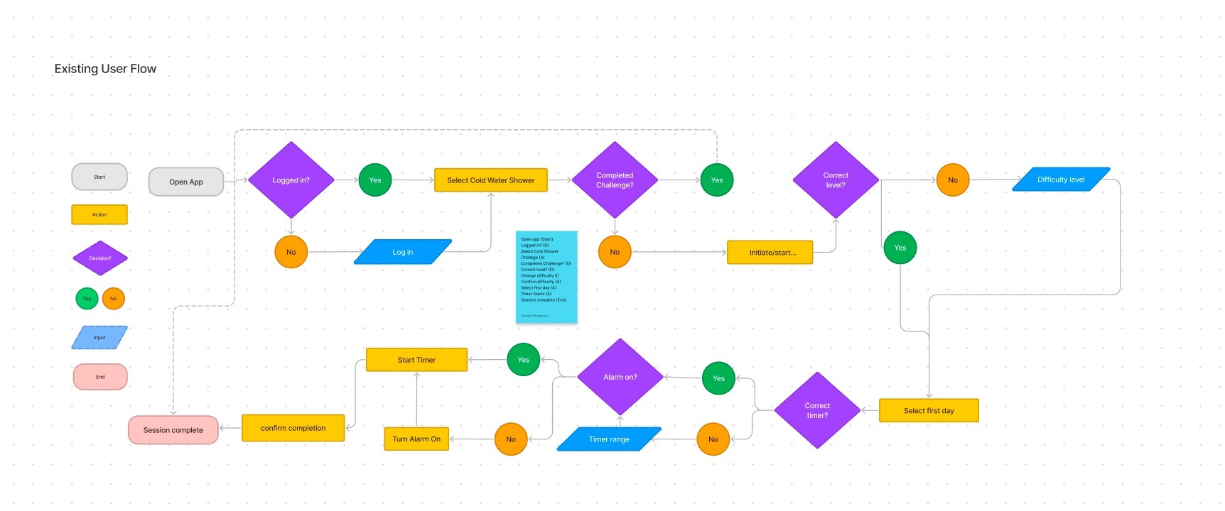
User Flows
Following Ideation we created user flows of the existing experience and improved the flow based on the idea that would fit with business and user goals.

Rapid Prototyping
Having mapped an improved user flow, we rapidly drew prototypes for a solution. Sketching helped me rapidly iterate on the original idea and visualise a solution without committing too early to high-fidelity screens.

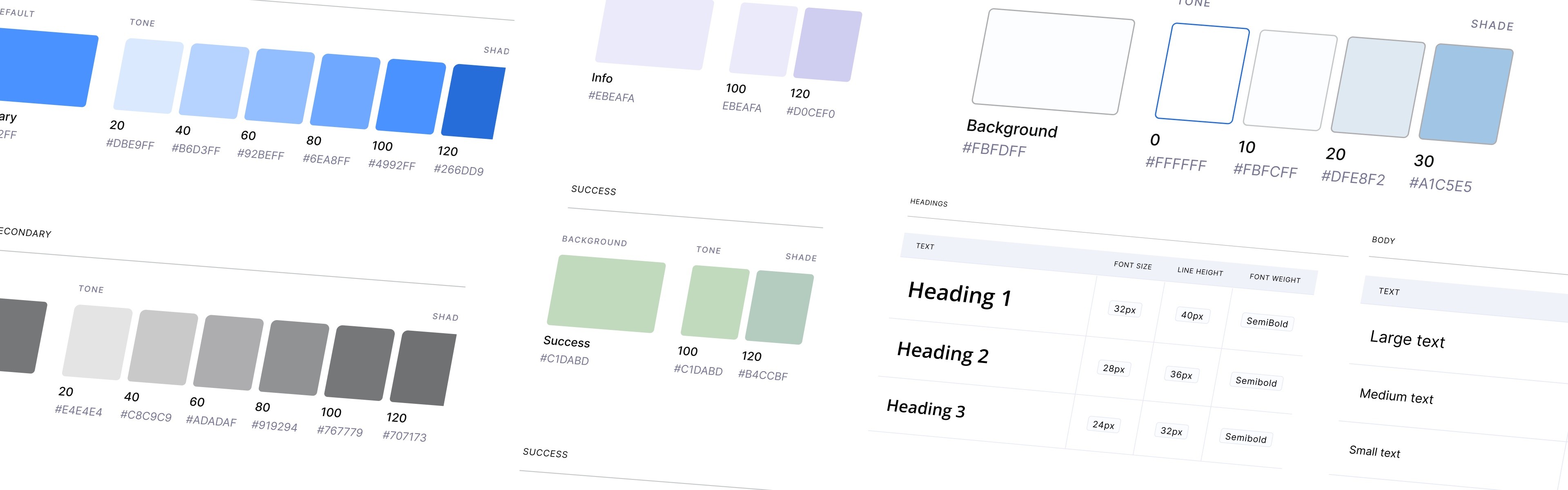
Styles & Components
Before creating the hi-fidelity prototype, we defined the product styles and interactive components in Figma to easily and quickly help us design consistently.
High Fidelity Prototype
Below is the final version of the prototype that we created. We included interactions and transitions from Figma to match the flow of the produc
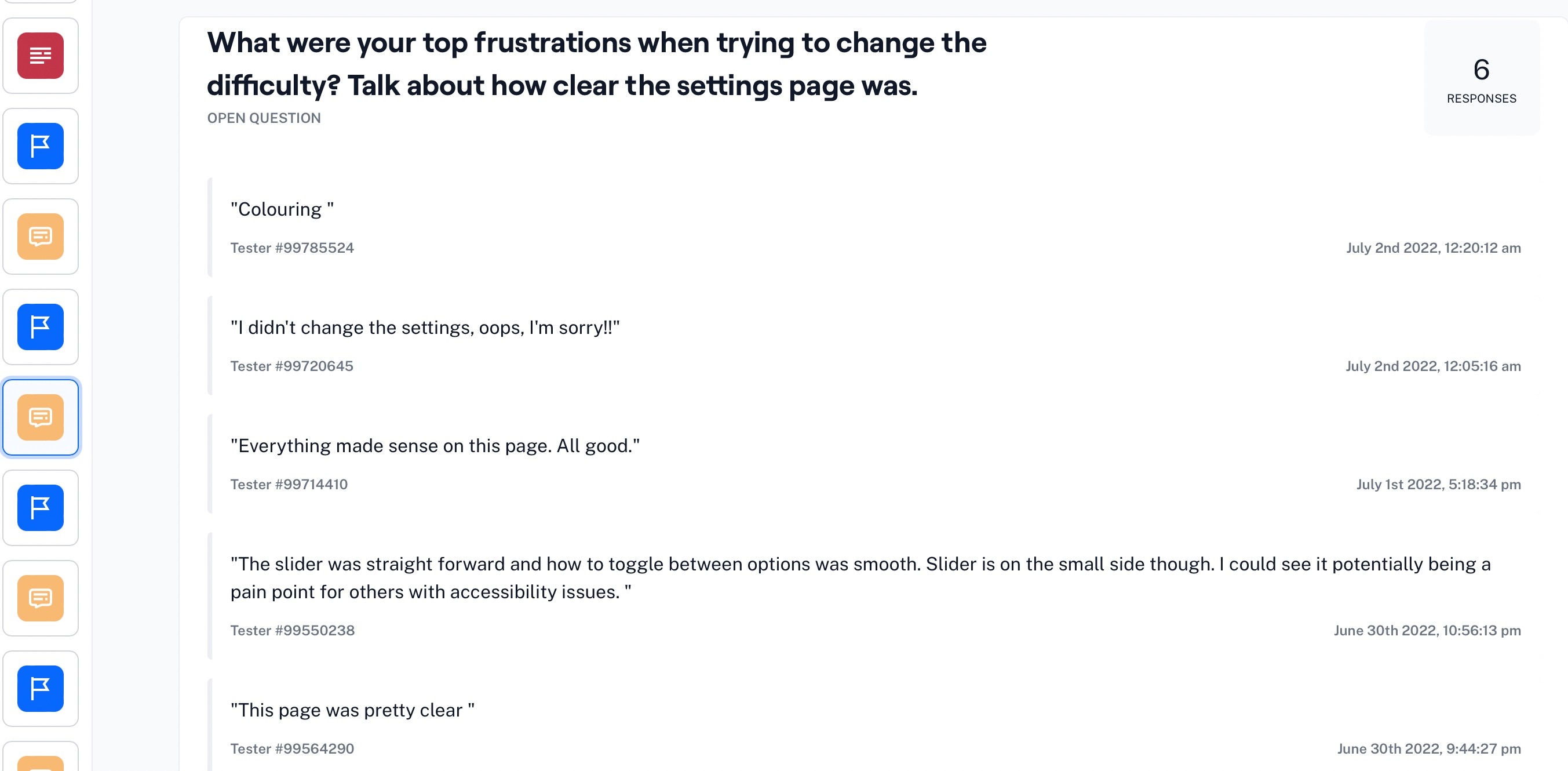
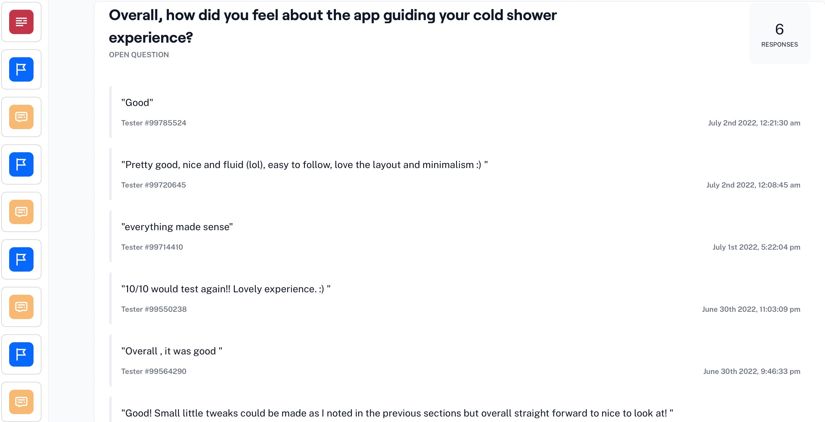
Usability Testing
To test the prototype we used Maze and gathered feedback following every task.
Three key learnings
1. The "Start Challenge" option should be accessible in the top of the home screen.
2. Toggles should be bigger and use clear accent colours
2. Users enjoyed the badge system and found it motivated them to continue
Next steps
If we create another path to start the challenge and improve the settings pages, users will feel more motivated to start, complete and continue the challenge, enhancing the number of users converting to a paid subscription.