
Role
User Research
Product Strategy
UI Design
Usability Testing
Tools
Figjam
Confluence
Figma
Notion (for notes)
⚠ Disclaimer
EY work is covered by an NDA — these case studies focus on the research approach, design decisions, and impact rather than on final deliverables.
Tax professionals using EY's Information Request system lack visibility into historical client responses. This leads to repetitive questioning, inefficient review processes, and missed opportunities to leverage existing data for more targeted follow-ups.
The Process
Discovery & Research Planning: Before jumping to solutions, I ran a heuristic review of the existing IR system to map where users were dropping off or working around the tool. I identified three recurring patterns: tax professionals were copy-pasting responses from previous-year PDFs, team leads were re-asking questions clients had already answered, and reviewers had no way to verify whether a response was new or carried over.
Generative Research: I conducted 6 semi-structured interviews with tax professionals across two client engagement teams. My goal was to understand not just the workflow, but the mental models behind how they thought about "old" vs "current" client data — whether they trusted it, when they wanted to see it, and what would make them anxious about relying on it. This framing, drawing on my background in social psychology, shaped how we thought about the feature's trust and control mechanics.
Synthesis: I clustered findings into three tension areas: visibility vs clutter, trust vs convenience, and individual preference vs team consistency. These became the design constraints we worked within.
Ideation & Iteration I explored three approaches — an inline toggle, a side panel, and a comparison view — and ran a quick concept test with 4 participants to pressure-test assumptions before committing to high-fidelity designs.
The Solution
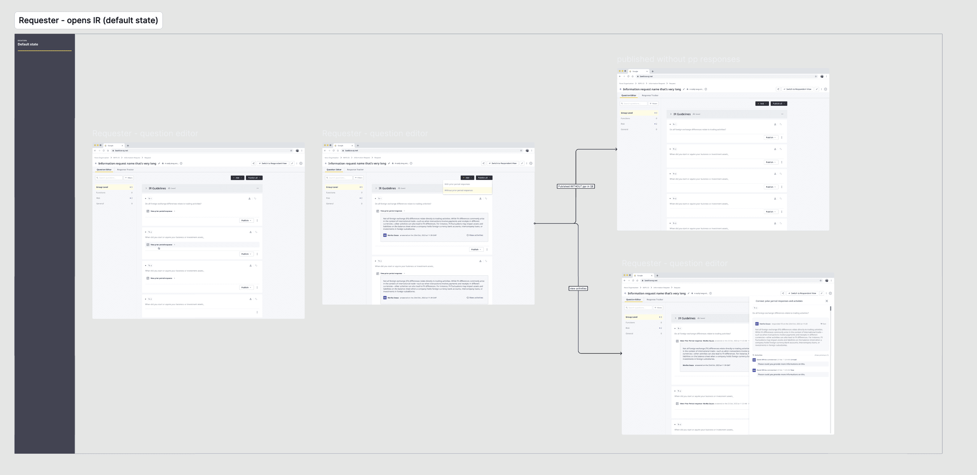
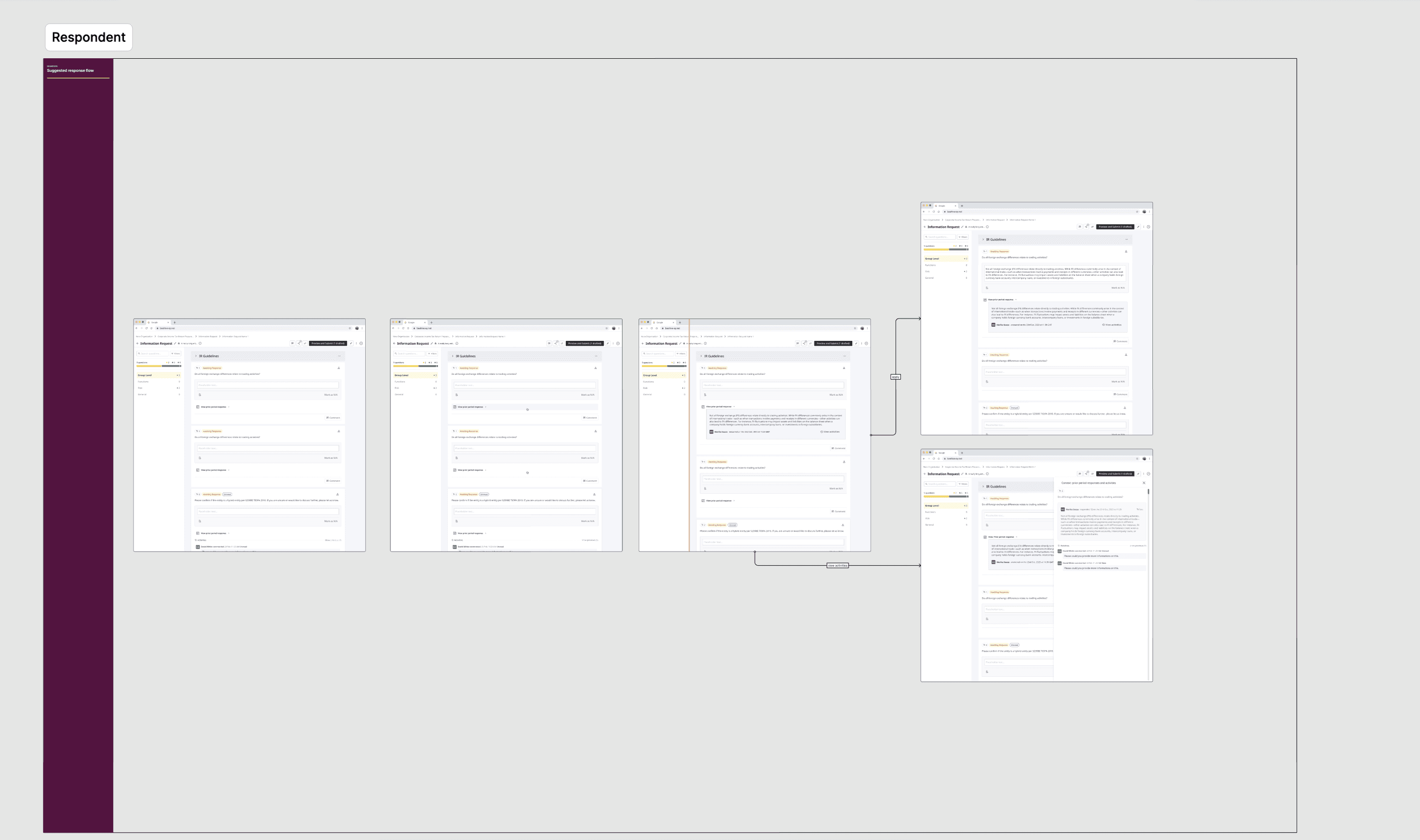
The team (PM's, devs) and I worked on a Prior Period Response feature that gives tax professionals instant access to historical client data while maintaining control over when and how it's displayed. We created an intuitive toggle system that allows users to quickly view previous year responses directly within a question editor. This allowed for more informed decision-making without cluttering the interface. The solution balances the need for historical context with user concerns about client data accuracy, providing configurable options that ensure prior period responses enhance, rather than replace current year submissions.
Usability Testing
With a proposed direction in place, I ran moderated usability testing sessions with 5 tax professionals to evaluate the toggle interaction and card-based access to prior period responses. Participants were given realistic task scenarios — reviewing a client's current year submission while referencing their previous answers — to observe how naturally they reached for historical data and where hesitation occurred.
Key observations across sessions pointed in a consistent direction: users felt comfortable with the toggle as a concept but wanted the prior period response visible directly on the card, not tucked behind a flyout. Several participants also expressed a longer-term need to see the full audit log from the previous year, suggesting the feature had potential to expand beyond its initial scope.
Results
Testing confirmed that the flyout approach created an unnecessary extra step for a task users wanted to complete quickly. We iterated on the design to surface prior period responses inline on the card, reducing friction without adding visual clutter to the interface. I worked with the development team to define the technical requirements for this interaction and created detailed specifications for the card component, including edge cases around missing or incomplete historical data.
The feature was successfully shipped and reached a 70% usage rate — a strong signal that surfacing historical context at the right moment meaningfully changed how tax professionals approached their review process.